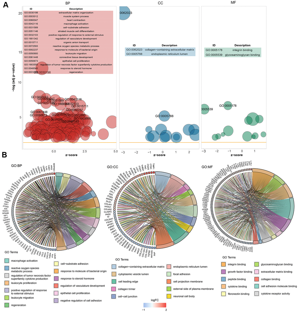
Figure 3.Graph showing the enrichment analysis results. (A) Bubble plot of GO enrichment results. Biological processes are shown on the left, cellular components are shown in the middle, and molecular function is shown on the right. The x-axis represents the z-score, and the y-axis indicates the −log10(adj P) values. A bubble represents a GO term, with the size of the bubble indicating the number of genes in the GO term. The results after deduplication of the GO enrichment results are shown, and the threshold is 75% coverage. The GO terms with –log10(adj P) > 5 are marked and shown in the table. (B) Ring plot showing GO enrichment. The left side indicates the DEGs, the red gene band indicates upregulation, and blue indicates downregulation. The band on the right with different colors represents different GO terms. The connecting line indicates that the gene is included in the GO term.