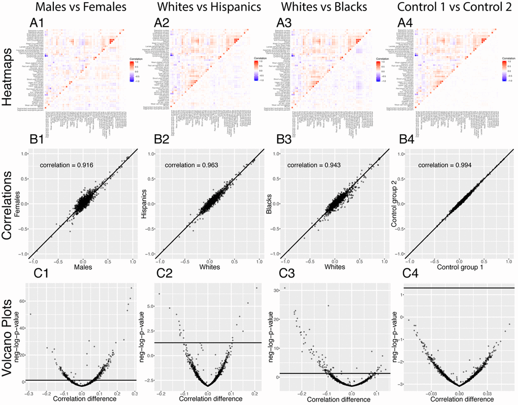
Figure 7.Correlations: Baseline differences between demographics. (A) Heatmap visualization of correlation structure. The upper left triangle shows the correlation structure for the first group of the comparison (e.g. males) while the lower right triangle of the matrix shows the difference between the second group and the first group of the comparison (e.g. difference between females and males). (B) Correlation between the 1,225 correlations of the first group (e.g. males) and the 1,225 correlations of the second group (e.g. females). The diagonal black line represents a perfect correlation. The further away from this line the points lie, the bigger the difference between the two groups, and the lower the correlation coefficient. (C) Volcano plots of the 1,225 differences in correlations between the groups. The horizontal black lines represent the threshold of significance of 0.05 for the Bonferroni corrected p-values. The vertical axis is not shared between the plots.