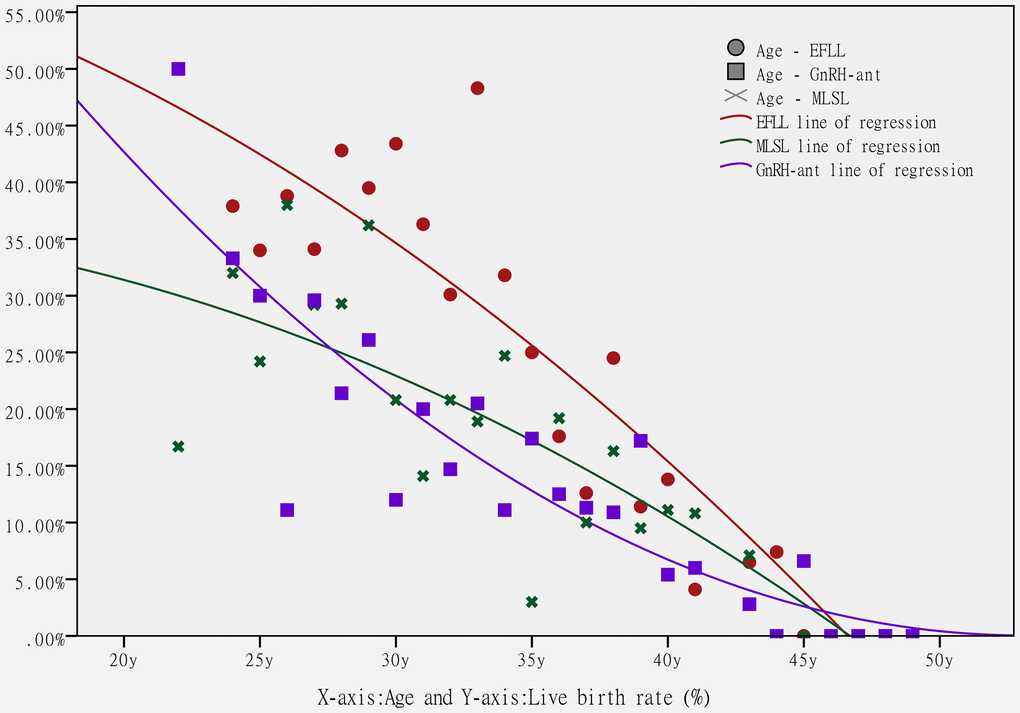
Figure 2.The scatter plots and logistic regression lines of the live birth rate for each age group in the three protocol groups. The circles (○ plot) represent the live birth rate for each age group in the EFLL protocol, the stars (× plot) represent the live birth rate for each age group in the MLSL protocol, and the boxes (□ plot) represent the live birth rate for each age group in the GnRH-ant protocol. There are three logistic regression lines, each representing the relationship between age and the live birth rate (red line: EFLL protocol, green line: MLSL protocol, purple line: GnRH-ant protocol). The x-axis represents age and the y-axis represents the live birth rate.