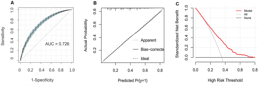
Figure 4.Evaluation of the nomogram model. (A) Receiver operating characteristic curve for the nomogram generated using bootstrap resampling (500 times). (B) Nomogram calibration plot. When the solid line (performance nomogram) was closer to the dotted line (ideal model), the prediction accuracy of the nomogram was better. (C) Decision curve analysis for the prediction model. The red solid line is from the prediction model, the gray line is for all patients with CHD, and the solid horizontal line indicates no patients have CHD. The graph depicts the expected net benefit per patient relative to the nomogram prediction of CHD risk. The net benefit increases as the model curve is extended.