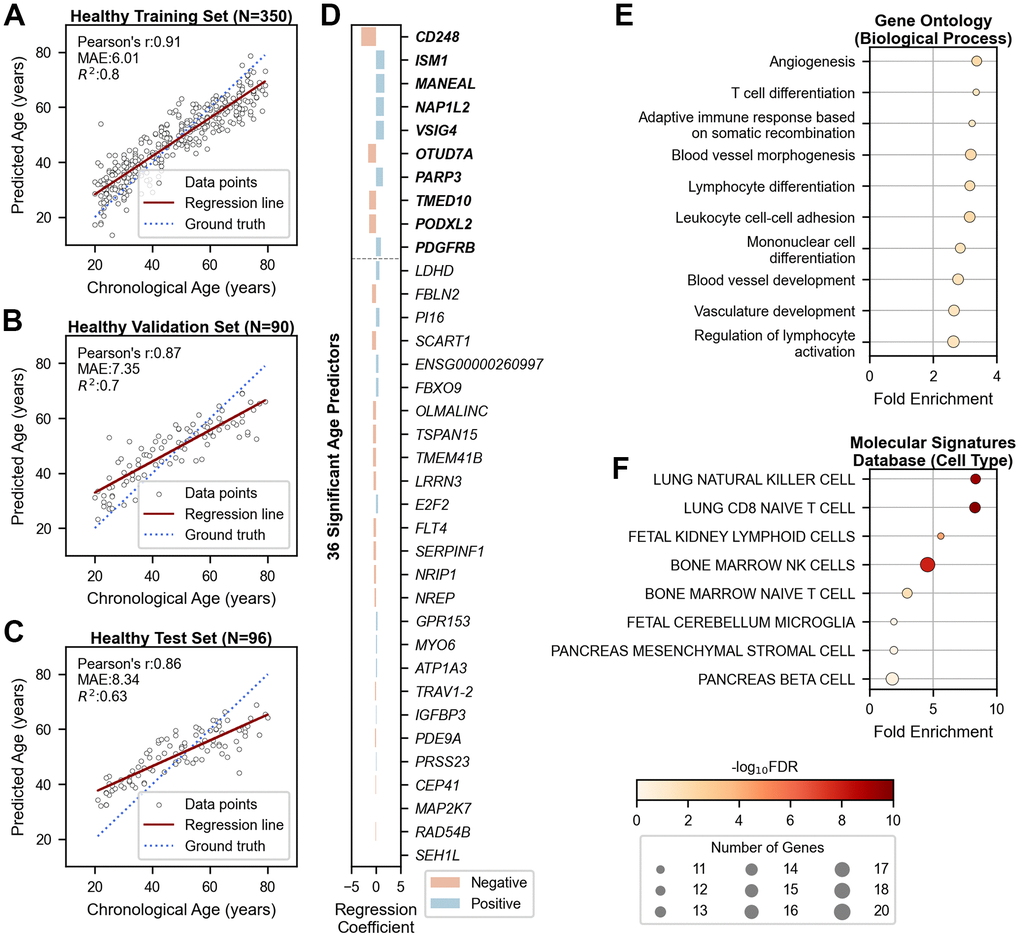
Figure 1.Chronological age prediction using 36 genes in healthy cohorts. (A–C) Scatter plots showing the performance of the age prediction model on (A) training (N=350), (B) validation (N=90), and (C) independent test (N=96) data. The x-axis shows chronological age, and the y-axis shows predicted age based on the mRNA clock. Each sample is represented by an open black dot, with a solid red line indicating the regression trend and a dotted blue line indicating perfect correlation. (D) Bar plot showing genes ranked by their importance in age prediction. The x-axis shows regression coefficients, and the y-axis lists the gene symbols of the 36 age-predictive genes. The top ten genes are shown in bold. Blue and red bars indicate positive and negative associations with aging, respectively. (E, F) Dot plots displaying gene-set enrichment results of the 36 age-predictive genes with their 180 co-expressed genes based on (E) Gene Ontology (Biological Processes) and (F) Molecular Signatures Database (Cell Type). The x-axis represents fold enrichment, and the y-axis portrays the top ten annotated biological functions, sorted by fold enrichment (FDR < 0.05). Dot color denotes the statistical significance, and dot size indicates the number of enriched genes. MAE = Mean Absolute Error; r = Pearson’s Correlation Coefficient; R2 = Coefficient of Determination; FDR = False Discovery Rate.