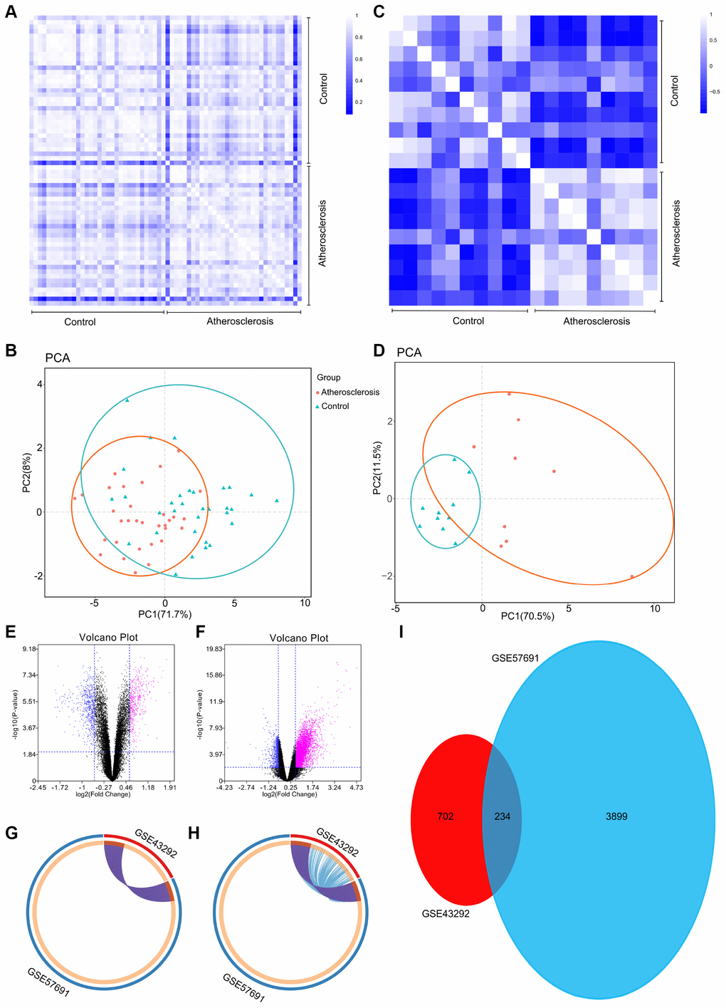
Figure 1.(A) Pearson’s correlation analysis of samples from the GSE43292 dataset. The color reflects the intensity of the correlation. When 0B) PCA of samples from the GSE43292 dataset. In the figure, principal component 1 (PC1) and principal component 2 (PC2) are used as the X-axis and Y-axis, respectively, to draw the scatter diagram, where each point represents a sample. In such a PCA diagram, the farther the two samples are from each other, the greater the difference is between the two samples in gene expression patterns. (C) Pearson’s correlation analysis of samples from the GSE57691 dataset. The color reflects the intensity of the correlation. (D) PCA of samples from the GSE57691 dataset. (E) The volcano plot illustrates the differences between control and atherosclerotic tissues after analysis of the GSE43292 dataset with GEO2R. (F) The volcano plot illustrates the difference between control and atherosclerotic tissues after analysis of the GSE57691 dataset with GEO2R. (G) Overlap between differently expressed gene lists of GSE43292 and GSE57691 only at the gene level, where purple curves link identical genes; (H) Overlap between differently expressed gene lists of GSE43292 and GSE57691 not only at the gene level, but also at the shared term level, where blue curves link genes that belong to the same enriched ontology term. The inner circle represents gene lists, where hits are arranged along the arc. Genes that hit multiple lists are colored in dark orange, and genes unique to a list are shown in light orange. (I) The Venn diagram could demonstrate that 234 genes were contained in the GSE43292 and GSE57691 datasets simultaneously.