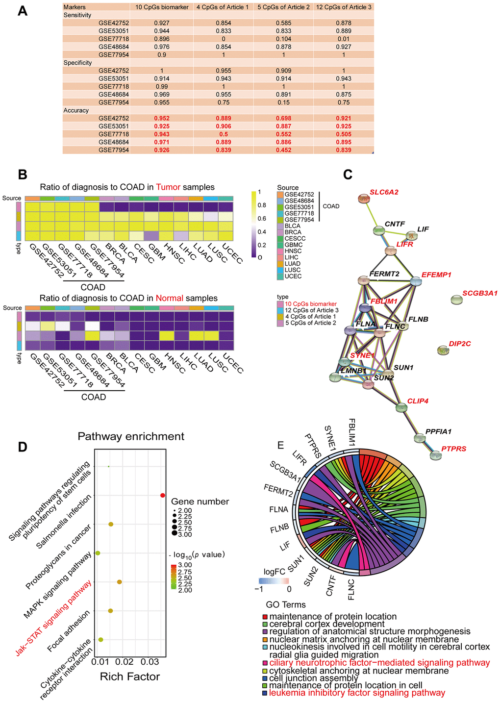
Figure 4.Performance comparison of diagnostic models and enrichment analysis of the corresponding genes. (A) Table displaying the classification performance of different methylation models for COAD and normal tissues in five independent GEO cohorts (GSE42752, GSE53051, GSE77718, GSE48684 and GSE77954). In addition, Azuara et al. [24] (Article 1) reported four CpG sites as diagnostic biomarkers for COAD, and the methylation values for each of them were available in the COAD cohort from TCGA; Beggs et al. [25] (Article 2) reported six CpG sites as diagnostic biomarkers for COAD, and the methylation values for five of them were available in the COAD cohort from TCGA; and Naumov et al. [26] (Article 3) reported 14 CpG sites as diagnostic biomarkers for COAD, and the methylation values for 12 of them were available in the COAD cohort from TCGA. (B) Heat map comparing our diagnostic model with the previous methylation models. Rows are labeled with the different sources of methylation data. The legend indicates that the range is 0-1. The color represents the percentage of the total samples predicted to be COAD. In the cohorts for the nine different cancer types, the ideal results should be 0. (C) Predicted protein interaction network of the genes corresponding to the COAD-specific diagnostic biomarkers. Version 11.0 of the STRING protein database was used. The different line colors represent different kinds of correlations between the proteins corresponding to the model (dark blue for coexistence, black for co-expression, pink for an experiment, light blue for a database, green for text mining, and purple for homology). The red genes are the corresponding genes of the diagnostic biomarkers. Note that CLIP4 is the corresponding gene for both cg08808128 and cg05038216. (D, E) KEGG (D) and GO (E) enrichment analysis results from the STRING protein database. All seven results are shown for the KEGG enrichment analysis, and the top 10 results are shown for the GO enrichment analysis, with p-values arranged from large to small. In the KEGG enrichment graph (D), the X-axis represents the Rich factor, indicating the degree of enrichment (Rich factor = observed gene counts/background gene counts), and the Y-axis represents the enriched KEGG terms. The color represents the -log10 (p-value), and the size of the dot represents the number of genes. In the GO enrichment graph (E), the GO term indicates the GO enrichment pathway.
Figure 4 — Colon cancer-specific diagnostic and prognostic biomarkers based on genome-wide abnormal DNA methylation | Aging