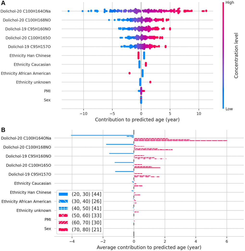
Figure 3.SHAP values illustrating the contribution of each feature to predicted age. (A) Beeswarm plot displaying the relative importance and direction of influence of each feature on age predictions. (B) Bar plot showing how each feature contributes to age predictions across different age groups, binned by decade.