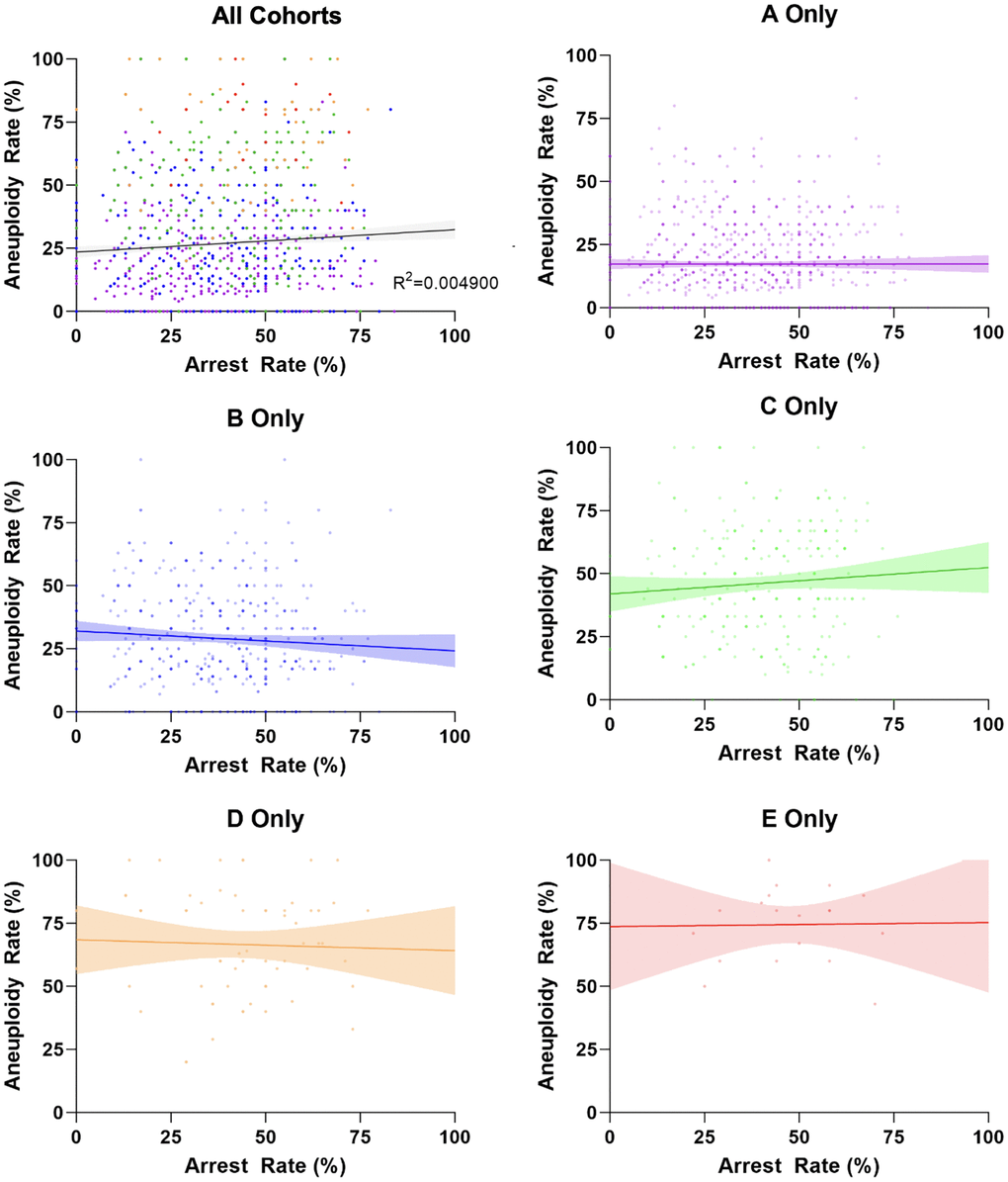
Figure 2.Correlation between arrest rate and aneuploidy rate per age group. Each plotted data point is an individual embryo cohort. The color of each individual data point matches the age groups in Figure 1. The lines represent the linear regression best fit (R2 for Pearson correlation and best fit line with 95% confidence interval), with all R2 values being less than 0.01 and revealing no correlation between both parameters.