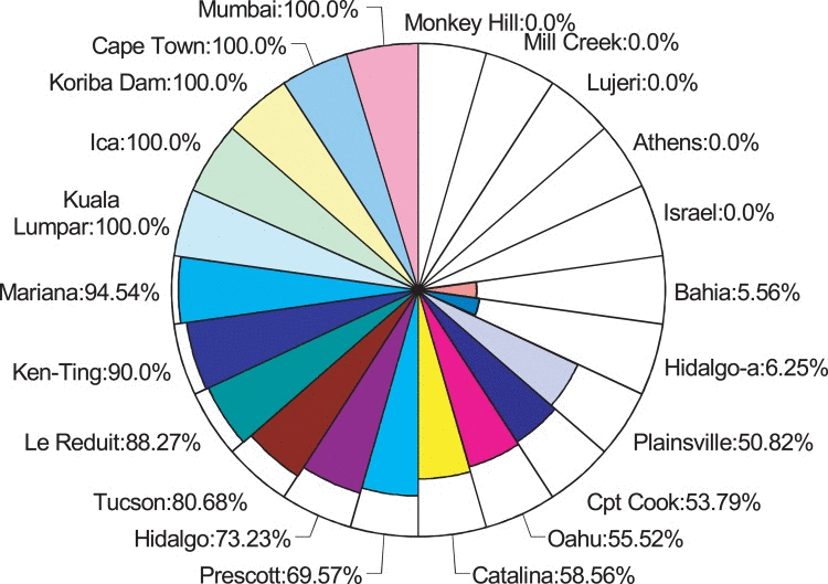
Figure 1.World-wide heterozygosity of Hoppel insertion in IndyFrequency of Hoppel insertion in isofemale inbred lines. Each part of the pie chart represents a line from a different geographic origin. The colored area in each represents the frequency of Hoppel + allele in that line (Table S1).
Figure 1 — Indy gene variation in natural populations confers fitness advantage and life span extension through transposon insertion | Aging