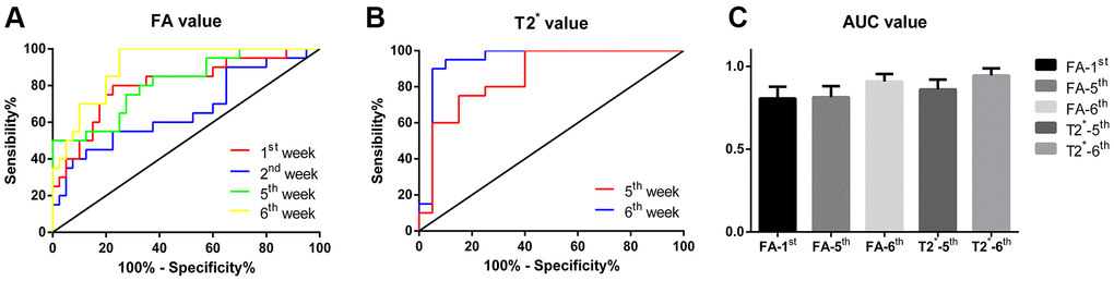
Figure 2.(A) The ROC curve of FA values at 1st, 2nd, 5th and 6th week respectively, the yellow broken line represents the curve of FA values at the 6th week, which is closest to the upper left corner, with the highest diagnostic efficiency; (B) The ROC curve of T2* values at 5th and 6th week respectively, the blue broken line represents the curve of T2* values at the 6th week, which is closest to the upper left corner and has the highest diagnostic efficiency. (C) Comparison of AUC of each subgroup, the results were not statistically different.