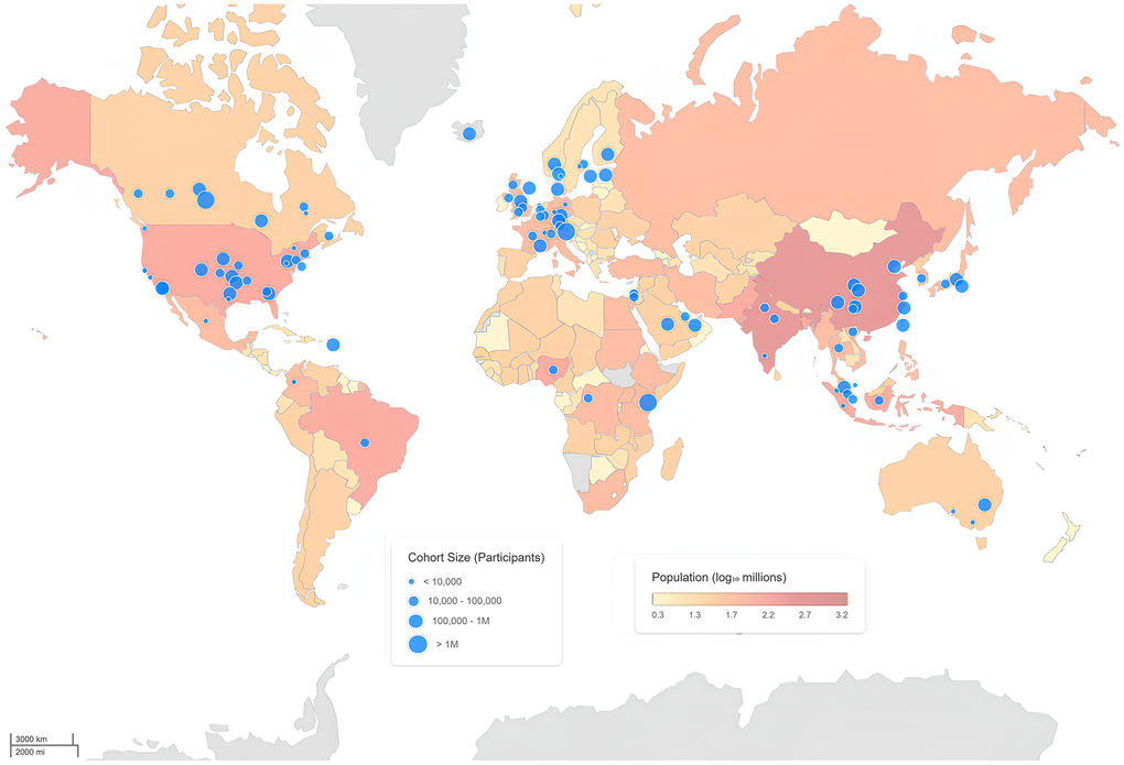
Figure 3.Global distribution of multi-omics cohorts studying healthy populations. World map depicting the geographic distribution of multi-omics studies conducted in healthy volunteers. Blue circles indicate the location of individual cohorts, with circle size proportional to cohort size (number of participants). Country-level population size (log scale, millions) is overlaid as a choropleth to provide demographic context. The map highlights the global concentration and regional disparities of existing multi-omics cohorts generating at least one omics dataset from biological samples (See Supplementary Information for details of datasets and analysis).